
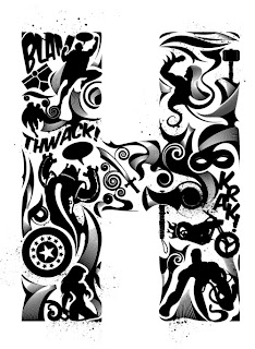
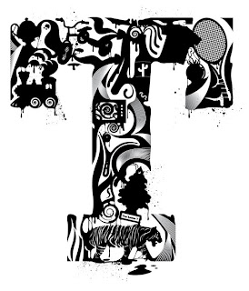
Heading in the direction of type as form and type functionality I am going to look at Steven Bonner, a designer, illustrator and typographer who's work seems to echo the work of M/M quite significantly. Steven runs his own freelance company called 'also known as', where he works on graphics and illustration. His work has been featured across the web, in print, and in books such as Custom Kicks, 1001 Restaurant Bar & Café Graphics, Vormator: Elements of Design, and Black & White Free drawings. He is represented by NB illustration in London.
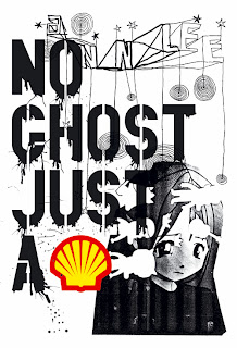
As with MM, Steven also works within a wide spectrum of the design industry and does not simply restrict himself to any one specific area. Steven's work has that edgy sometimes a little distorted feel (that MM seem to display in their work) incorporated into his. For example looking at MM 's 'No Ghost Just A Shell' piece, and a piece by Steven called 'And?' a T shirt design for Woot, its clear that these have similarities in the distorted sense, the dripping paint effect, and the use of monochrome, although with 'No Ghost Just A Shell' two single colours have been implemented, However Steven also applies a similar technique of adding a limited palette of colour to his monochrome designs - giving them a burst of life.
We are given examples of type as from with the 'Alphabet' and 'Alpha Men', plus Steven's 'And?' design is also an example of type as form, as it is constructed with the use of abstract shapes and patterns, however i wouldn't consider his typographical approach to be in the exact accordance as MM's, MM don't seem to take advantage of perhaps using a basic silhouette or outline guide of a pre designed letterform that then needs to be filled with the abstract imagery, rather it seems that the imagery is laid out and obviously rendered to flow in the shapes of the letterforms - creating letterforms that are in-fact staying true to the nature of the abstract imagery by making abstract letterforms. Steven seems to use a basic set of pre determined letter guides which he then fills with his designs bringing the type to life. The use of his chosen designs to fill the letterforms is what creates the outlines of the type he produces.
MM's typographical design differs in the sense that it's one complete, yet manipulated image that makes the letterforms possible, however with Steven the letterforms are created through a process of arranging many designs in a particular order which as a bigger picture creates a letterform.
I would say that Steven's approach to type design has a higher degree of functionality than that of MM's, purely for the fact that, yes although his letterforms do appear as type as form/image, they also seem to pay a greater deal of attention to structure, good structure means improved legibility and therefore better functionality.
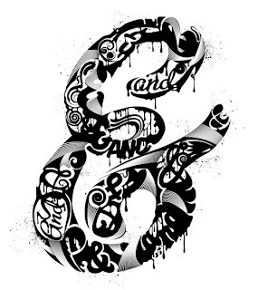
'And?' T shirt design for Woot.
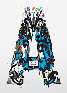
A is for Art
Howe - apparel graphics for US company Hause of Howe.


