An influential type foundry in NYC run by designers Jonathan Hoefler and Tobias Frere Jones. Founded in
1989 as Hoefler & Frere-Jones. They develop fonts for both retail and for individual clients, during the early
90's they became the dominant voice in editorial typography. They have had commissions for Rolling Stones,
Sports illustrated, Harpers Bazaar and The New York Times. As with Erik Speikermann, H&F-J work in a very particular field of design, concentrating purely on the
beauty and functionality of typographic design. The typefaces that H&F-J produce have been used broadly
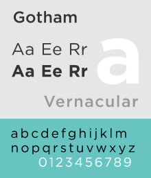
in many habitats, such as their Gotham typeface, - "which has been used on soda cans, boarding passes, billboards and banner ads; we've seen it engraved in marble on a cornerstone, and cast in rubber on the sole of a shoe. One newspaper used Gotham for financial listings, another for saucy tabloid headlines"
This goes to show just how capable they are at catering for such a diverse collection of clients by making typefaces that work across all the channels.

The Gotham typeface because of it's connections to NYC history was chosen in 2004 to inscribe the 26 words on the cornerstone of the Freedom Tower - the site of the former World Trade Centre.
"The typeface, Gotham, deliberately evokes the blocky, no-nonsense, unselfconscious architectural lettering that dominated the streetscape from the 1930's through the 1960's in building names, neon signs, hand-lettered advertisements and lithographed posters."
"Michael Gericke, a partner in the Pentagram studio, which designed the cornerstone ... said Gotham "didn't look like something that was created yesterday and would be gone tomorrow ... It seems like it's part of the larger urban environment," he said. "It seems, in a way, that it's always been there." Another Pentagram partner, Michael Bierut, likened Gotham to the Manhattan street grid. "It doesn't show individual authorship," he said, "but it shows a character you wouldn't find anywhere else."


Returning to MM Paris, and the way they apply the type so that it doesn't simply sit within the design but it is part of the design as a whole - the type is the actual design, this is quite the opposite with H&F-J, they use type as a totally separate component within the design, this works just as
well, as the type is clean and coordinated, a freshly carved appearance. MM's style uses shapes, illustrations
and abstract themes as a medium for producing fun and exciting letterforms, that in most cases are very
experimental and often varying in every aspect of the anatomical values of typographic design, whereas
H&F-J create clean cut, beautifully symmetric letterforms through a complex and time consuming regime.
Yes they both produces typographic solutions to briefs, but in terms of how they go about - they couldn't
be further from one another - a world apart.
