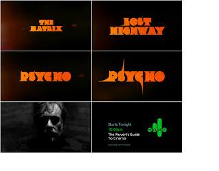
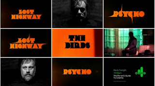
I have chosen this as my next link as i noticed that both Mario Hugo and Non-Format have worked for Channel 4 on different projects. Mario designed some work for' Channel 4's 25th Anniversary Book', whereas Non-Format designed for Channel 4's 'The Perverts Guide To Cinema' - in 2006 they
did the typography for a more 4 trailer documenting the pending show.


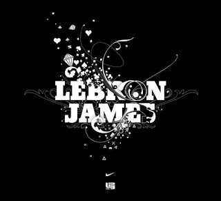
However, this may be the case but i am going discuss how the typographic style of Non-Format further delves into an area where a higher ratio towards type legibility and functionality yet also stunningly attractive illustrative processes combine brilliantly. For example take the work that they did for the launch of LeBron James's new basketball shoe Zoom Lebron III from Nike. The typographical style applied places a huge amount of importance on the legibility of the type used, the letters seem to have only been manipulated slightly, just enough to convey certain feelings and thoughts, without over doing it.
It seems to be a very digital style, a methodical approach whereby intricate illustrations accompany the type resulting in the type having a very illustrative style, however the type has had little modification, it's what's going on around or over the letterforms that creates the ambience of Non Format's typographical designs -the ambience being the implemented intricate designs.
In some cases these implemented designs often go as far to replace certain letterforms completely, this isn't a complete intrusion on the whole piece of type, just a elegant way of extending the intricate nature of the illustrative style without over doing it. This style seems to have an infectious quality, as it runs and flows on it's path, it manipulates various aspects of the type, again not overdoing it. Not each and every letterform is distorted, (only few are slightly altered in appearance) this is a really subtle typographic process.
I have came to the conclusion that Non Format place much emphasis on type functionality and legibility, more importance is placed on communicating the words clearly and effectively, rather than propping up the type with what may be too much unnecessary clutter. The implemented illustrations are derived from the requests of the client or the nature of the brief's subject, therefore the designs are not made as initial typographic illustrations but are typographic solutions with a limited illustrative input - the used type isn't dramatically altered.


