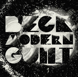
Striking an equal balance between typographic illustration and functionality is what Mario Hugo can do very well, Mario Hugo integrates illustrations, typography and handcrafts in various ways. He is renown for his creative type designs and stunning illustrations for clients such as Warp Records, Dolce and Gabbana, Channel 4, and The Fader.
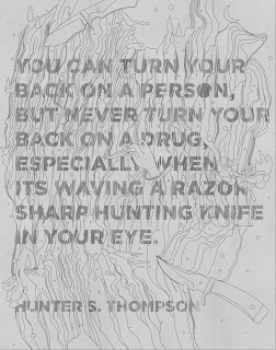
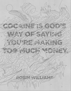
I feel that Hugo has created in-many pieces of his work a strong balance between the illustrative processes used and the level of legibility and functionality that his work offers, his experimental illustrative passion isn't substituted for the inclusion of type and vice versa, resulting in beautiful designs that have a smooth finish and an equally smooth legibility. A fine example of just how experimental he is would be
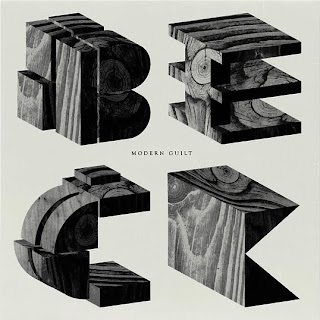
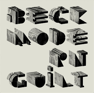
the artwork he did for Beck's latest album, (however it was unused), it featured wood block letters, with a relatively simple layout, but was visually stunning with a precise clean finish.
As with MM's work the type is a feature that is an integral part of the design, not only is it a piece of type but it is also the context that the relevant information is presented as. However the type with Mario Hugo gives the feel that it is leaving type as form behind and is concentrating more on the aspect of functionality,
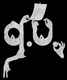
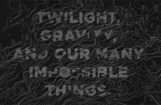
the letterforms have a more consistent and solid presence. They are not as distorted or perhaps manipulated as MM Paris or Steven Bonner's working style, however they still have that edgy experimental feel. A simpler way to explain this would be to say that MM's work has a very strong bias towards the high end of the experimental spectrum whereas yes Mario does experiment but it is approaching the mid section, an area where as i have mentioned earlier strives to form an equal balance between beauty and legibility/functionality, you could say that his work has a tampered feel. Little has been applied to it, just enough to make the designs subtly attractive, i like his style. Mario' s type work looks to use traditional style typefaces infused with external illustrative elements which slightly manipulate the type.
