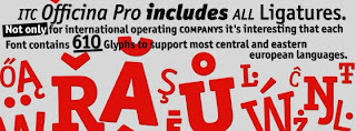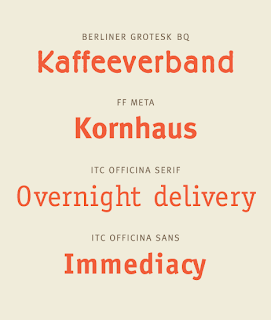
ITC Officina Pro
"Practicality and style –no, it’s not the perfect shoe, it’s ITC Officina. This large and incredibly versatile typeface family offers industrial-strength functionality without sacrificing charm."
"When Erik Spiekermann first conceived of Officina during the early 1980s, his goal was to create a family of type that was ideally suited for office correspondence and business documentation. Midway through the design process, however, Officina revealed capabilities far beyond its original intention. Early tests showed that Officina could stand on its own as a highly legible, remarkably functional type style. Spiekermann“s ambitions for the design now extended beyond the office environment; he sought to develop a family of type suitable for a wide range of typographic applications. "

Moving from Non Format to Erik Spiekermann, this may seem like an irrational jump in the spectrum, however i feel that it is a comfortable move into type being mainly functional, considering the fact that Non Format are approaching a greater balance towards type being functional over type as format.
Speikermann is a German typographer and designer, he has designed many commercial typefaces as well as typefaces as part of corporate design programs. Speikermann's methods of design flow in a very specific direction with the concentration being purely on creating good, clear and functional typefaces for mass consumption, whereas the likes of MM Paris create loose abstract style typefaces for specific individual needs of a broader range of clients, or "one off clients".
“you are designing not the black marks on the page, but the space in between.” - Erik Speikermann, this quote shows that the type that Speikermann produces is produced using a systematic method, where everything is clean, structured and coordinated, using this system as a template for designing yourself would give a set of clean letterforms, whereas the methods of MM Paris or Steven Bonner allow total freedom of design due to the fact that there seems to be little rules held down in place restricting the approach to producing typography, I mean looking at MM's work could you imagine them approaching a brief with the thought in mind that they are designing "the space in between" rather than the total experimental approach that they abide by to produce their typography.
Speikermann's style of clean cut typography show that he works to a very traditional set of rules, however this doesn't mean that he has to create unattractive, dull typefaces, it just means that the typefaces he does produce have their own sense of beauty and consistency in place, the equivalent of say MM's typographical designs having a consistent feel, made up off the very randomness of the loose structure and the actual nature of the letterforms such as the Alphabets and the Alpha Men.
Speikermann's approach is focussed entirely on type being applied to places where it will be witnessed by huge audiences day in day out - purely about the end process of the printed word, so therefore the type must be created in accordance with certain rules. With MM they have the freedom to be as creative as they wish due to the nature of their design methods, without feeling held back by restrictions, now it could be argued that Speikermann is held back by a creative grudge due to his techniques staying true to traditional values, but like i have mentioned earlier this doesn't mean to say that he is limited, rather he just tackles the creative side of things differently than what the likes of MM may do.
I think that Speikermann's approach is a winner as even if he produces a typeface for a certain client, that typeface will still be just as legible and as functional in still say 10 years time, it can be used again and again, in many situations other than what it was originally designed for, and still look like it could have been designed for that particular brief 10 years later. However a piece of typography or a typeface from MM wouldn't have that never "gets old quality" or "can be used over and over" as the design's are very specific to the brief set at the time, they simply wouldn't fit as well if they were repeatedly used, the practical aspect would be diminished.

