Hoefler & Frere-Jones


An influential type foundry in NYC run by designers Jonathan Hoefler and Tobias Frere Jones. Founded in
1989 as Hoefler & Frere-Jones. They develop fonts for both retail and for individual clients, during the early
90's they became the dominant voice in editorial typography. They have had commissions for Rolling Stones,
Sports illustrated, Harpers Bazaar and The New York Times. As with Erik Speikermann, H&F-J work in a very particular field of design, concentrating purely on the
beauty and functionality of typographic design. The typefaces that H&F-J produce have been used broadly
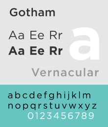
in many habitats, such as their Gotham typeface, - "which has been used on soda cans, boarding passes, billboards and banner ads; we've seen it engraved in marble on a cornerstone, and cast in rubber on the sole of a shoe. One newspaper used Gotham for financial listings, another for saucy tabloid headlines"

This goes to show just how capable they are at catering for such a diverse collection of clients by making typefaces that work across all the channels.


The Gotham typeface because of it's connections to NYC history was chosen in 2004 to inscribe the 26 words on the cornerstone of the Freedom Tower - the site of the former World Trade Centre.

"The typeface, Gotham, deliberately evokes the blocky, no-nonsense, unselfconscious architectural lettering that dominated the streetscape from the 1930's through the 1960's in building names, neon signs, hand-lettered advertisements and lithographed posters."

"Michael Gericke, a partner in the Pentagram studio, which designed the cornerstone ... said Gotham "didn't look like something that was created yesterday and would be gone tomorrow ... It seems like it's part of the larger urban environment," he said. "It seems, in a way, that it's always been there." Another Pentagram partner, Michael Bierut, likened Gotham to the Manhattan street grid. "It doesn't show individual authorship," he said, "but it shows a character you wouldn't find anywhere else."


Returning to MM Paris, and the way they apply the type so that it doesn't simply sit within the design but it is part of the design as a whole - the type is the actual design, this is quite the opposite with H&F-J, they use type as a totally separate component within the design, this works just as
well, as the type is clean and coordinated, a freshly carved appearance. MM's style uses shapes, illustrations
and abstract themes as a medium for producing fun and exciting letterforms, that in most cases are very
experimental and often varying in every aspect of the anatomical values of typographic design, whereas
H&F-J create clean cut, beautifully symmetric letterforms through a complex and time consuming regime.
Yes they both produces typographic solutions to briefs, but in terms of how they go about - they couldn't
be further from one another - a world apart.


Erik Spiekermann


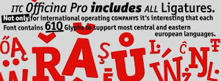
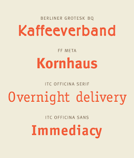
ITC Officina Pro


"Practicality and style –no, it’s not the perfect shoe, it’s ITC Officina. This large and incredibly versatile typeface family offers industrial-strength functionality without sacrificing charm."

All kinds of versatility
"When Erik Spiekermann first conceived of Officina during the early 1980s, his goal was to create a family of type that was ideally suited for office correspondence and business documentation. Midway through the design process, however, Officina revealed capabilities far beyond its original intention. Early tests showed that Officina could stand on its own as a highly legible, remarkably functional type style. Spiekermann“s ambitions for the design now extended beyond the office environment; he sought to develop a family of type suitable for a wide range of typographic applications. "


Moving from Non Format to Erik Spiekermann, this may seem like an irrational jump in the spectrum, however i feel that it is a comfortable move into type being mainly functional, considering the fact that Non Format are approaching a greater balance towards type being functional over type as format.

Speikermann is a German typographer and designer, he has designed many commercial typefaces as well as typefaces as part of corporate design programs. Speikermann's methods of design flow in a very specific direction with the concentration being purely on creating good, clear and functional typefaces for mass consumption, whereas the likes of MM Paris create loose abstract style typefaces for specific individual needs of a broader range of clients, or "one off clients".

“you are designing not the black marks on the page, but the space in between.” - Erik Speikermann, this quote shows that the type that Speikermann produces is produced using a systematic method, where everything is clean, structured and coordinated, using this system as a template for designing yourself would give a set of clean letterforms, whereas the methods of MM Paris or Steven Bonner allow total freedom of design due to the fact that there seems to be little rules held down in place restricting the approach to producing typography, I mean looking at MM's work could you imagine them approaching a brief with the thought in mind that they are designing "the space in between" rather than the total experimental approach that they abide by to produce their typography.

Speikermann's style of clean cut typography show that he works to a very traditional set of rules, however this doesn't mean that he has to create unattractive, dull typefaces, it just means that the typefaces he does produce have their own sense of beauty and consistency in place, the equivalent of say MM's typographical designs having a consistent feel, made up off the very randomness of the loose structure and the actual nature of the letterforms such as the Alphabets and the Alpha Men.
Speikermann's approach is focussed entirely on type being applied to places where it will be witnessed by huge audiences day in day out - purely about the end process of the printed word, so therefore the type must be created in accordance with certain rules. With MM they have the freedom to be as creative as they wish due to the nature of their design methods, without feeling held back by restrictions, now it could be argued that Speikermann is held back by a creative grudge due to his techniques staying true to traditional values, but like i have mentioned earlier this doesn't mean to say that he is limited, rather he just tackles the creative side of things differently than what the likes of MM may do.

I think that Speikermann's approach is a winner as even if he produces a typeface for a certain client, that typeface will still be just as legible and as functional in still say 10 years time, it can be used again and again, in many situations other than what it was originally designed for, and still look like it could have been designed for that particular brief 10 years later. However a piece of typography or a typeface from MM wouldn't have that never "gets old quality" or "can be used over and over" as the design's are very specific to the brief set at the time, they simply wouldn't fit as well if they were repeatedly used, the practical aspect would be diminished.

Non Format

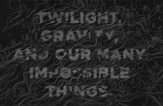
I am now going to look at the London based graphic design team Non - Format, Established by Kjell Ekhorn and Jon Forss in 2000, they work within; art direction, design, illustration and custom typography. They have worked with a range of clients including Channel 4, nike, Creative Review, Nokia and Coca Cola.

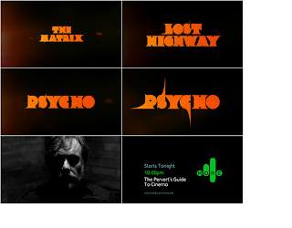
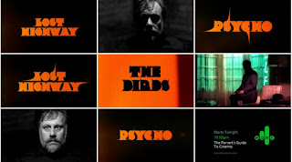
I have chosen this as my next link as i noticed that both Mario Hugo and Non-Format have worked for Channel 4 on different projects. Mario designed some work for' Channel 4's 25th Anniversary Book', whereas Non-Format designed for Channel 4's 'The Perverts Guide To Cinema' - in 2006 they
did the typography for a more 4 trailer documenting the pending show.


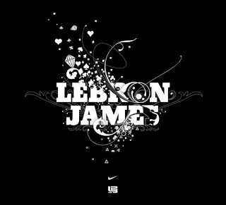
However, this may be the case but i am going discuss how the typographic style of Non-Format further delves into an area where a higher ratio towards type legibility and functionality yet also stunningly attractive illustrative processes combine brilliantly. For example take the work that they did for the launch of LeBron James's new basketball shoe Zoom Lebron III from Nike. The typographical style applied places a huge amount of importance on the legibility of the type used, the letters seem to have only been manipulated slightly, just enough to convey certain feelings and thoughts, without over doing it.

It seems to be a very digital style, a methodical approach whereby intricate illustrations accompany the type resulting in the type having a very illustrative style, however the type has had little modification, it's what's going on around or over the letterforms that creates the ambience of Non Format's typographical designs -the ambience being the implemented intricate designs.

In some cases these implemented designs often go as far to replace certain letterforms completely, this isn't a complete intrusion on the whole piece of type, just a elegant way of extending the intricate nature of the illustrative style without over doing it. This style seems to have an infectious quality, as it runs and flows on it's path, it manipulates various aspects of the type, again not overdoing it. Not each and every letterform is distorted, (only few are slightly altered in appearance) this is a really subtle typographic process.

I have came to the conclusion that Non Format place much emphasis on type functionality and legibility, more importance is placed on communicating the words clearly and effectively, rather than propping up the type with what may be too much unnecessary clutter. The implemented illustrations are derived from the requests of the client or the nature of the brief's subject, therefore the designs are not made as initial typographic illustrations but are typographic solutions with a limited illustrative input - the used type isn't dramatically altered.


Mario Hugo


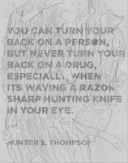
Striking an equal balance between typographic illustration and functionality is what Mario Hugo can do very well, Mario Hugo integrates illustrations, typography and handcrafts in various ways. He is renown for his creative type designs and stunning illustrations for clients such as Warp Records, Dolce and Gabbana, Channel 4, and The Fader.


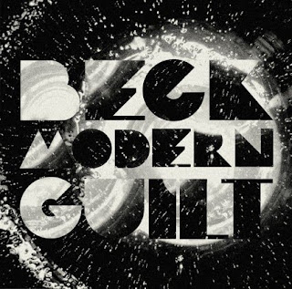
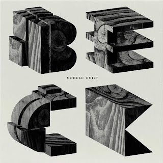
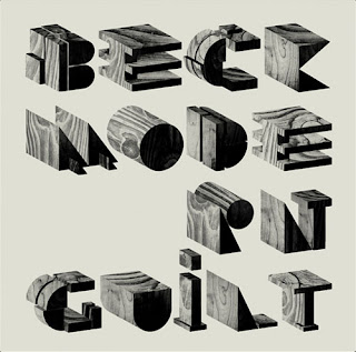
I feel that Hugo has created in-many pieces of his work a strong balance between the illustrative processes used and the level of legibility and functionality that his work offers, his experimental illustrative passion isn't substituted for the inclusion of type and vice versa, resulting in beautiful designs that have a smooth finish and an equally smooth legibility. A fine example of just how experimental he is would be
the artwork he did for Beck's latest album, (however it was unused), it featured wood block letters, with a relatively simple layout, but was visually stunning with a precise clean finish.

As with MM's work the type is a feature that is an integral part of the design, not only is it a piece of type but it is also the context that the relevant information is presented as. However the type with Mario Hugo gives the feel that it is leaving type as form behind and is concentrating more on the aspect of functionality,
the letterforms have a more consistent and solid presence. They are not as distorted or perhaps manipulated as MM Paris or Steven Bonner's working style, however they still have that edgy experimental feel. A simpler way to explain this would be to say that MM's work has a very strong bias towards the high end of the experimental spectrum whereas yes Mario does experiment but it is approaching the mid section, an area where as i have mentioned earlier strives to form an equal balance between beauty and legibility/functionality, you could say that his work has a tampered feel. Little has been applied to it, just enough to make the designs subtly attractive, i like his style. Mario' s type work looks to use traditional style typefaces infused with external illustrative elements which slightly manipulate the type.


Steven Bonner


Heading in the direction of type as form and type functionality I am going to look at Steven Bonner, a designer, illustrator and typographer who's work seems to echo the work of M/M quite significantly. Steven runs his own freelance company called 'also known as', where he works on graphics and illustration. His work has been featured across the web, in print, and in books such as Custom Kicks, 1001 Restaurant Bar & Café Graphics, Vormator: Elements of Design, and Black & White Free drawings. He is represented by NB illustration in London.

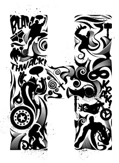
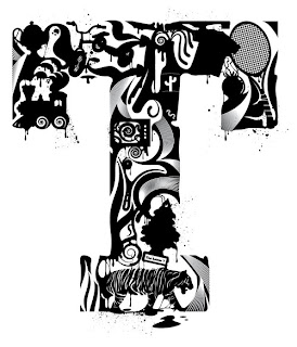
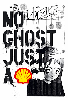
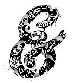
As with MM, Steven also works within a wide spectrum of the design industry and does not simply restrict himself to any one specific area. Steven's work has that edgy sometimes a little distorted feel (that MM seem to display in their work) incorporated into his. For example looking at MM 's 'No Ghost Just A Shell' piece, and a piece by Steven called 'And?' a T shirt design for Woot, its clear that these have similarities in the distorted sense, the dripping paint effect, and the use of monochrome, although with 'No Ghost Just A Shell' two single colours have been implemented, However Steven also applies a similar technique of adding a limited palette of colour to his monochrome designs - giving them a burst of life.

We are given examples of type as from with the 'Alphabet' and 'Alpha Men', plus Steven's 'And?' design is also an example of type as form, as it is constructed with the use of abstract shapes and patterns, however i wouldn't consider his typographical approach to be in the exact accordance as MM's, MM don't seem to take advantage of perhaps using a basic silhouette or outline guide of a pre designed letterform that then needs to be filled with the abstract imagery, rather it seems that the imagery is laid out and obviously rendered to flow in the shapes of the letterforms - creating letterforms that are in-fact staying true to the nature of the abstract imagery by making abstract letterforms. Steven seems to use a basic set of pre determined letter guides which he then fills with his designs bringing the type to life. The use of his chosen designs to fill the letterforms is what creates the outlines of the type he produces.

MM's typographical design differs in the sense that it's one complete, yet manipulated image that makes the letterforms possible, however with Steven the letterforms are created through a process of arranging many designs in a particular order which as a bigger picture creates a letterform.

I would say that Steven's approach to type design has a higher degree of functionality than that of MM's, purely for the fact that, yes although his letterforms do appear as type as form/image, they also seem to pay a greater deal of attention to structure, good structure means improved legibility and therefore better functionality.


'And?' T shirt design for Woot.
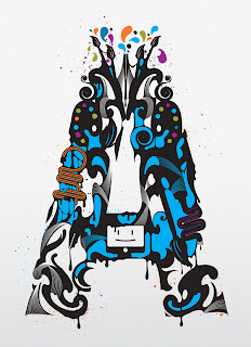
A is for Art

Howe - apparel graphics for US company Hause of Howe.


M/M Paris

The task in hand is to create a journey of six steps that links the work of M/M Paris to the work of Hoefler Frere-Jones. The journey must consist of six individual steps linking the first designer to the second.

On the surface comparing the work of M/M Paris to the work of H&F-J is naturally a challenge as they are both a world away from one another. On the one hand M/M Paris apply themselves to a huge chunk of the design industry, covering so many aspects, whereas H&F-J apply themselves specifically to typographic design in their type foundry in New York City.

However, typography is something that they both contribute to greatly (even if their execution of type design differs considerably).M/M apply type design into illustration, music, photography, and fashion, they apply the use of typography into the actual nature of the themes from which they are working, they make type to suit what their given brief may be, kind of like killing two birds with one stone, incorporating a passion for creating exiting typefaces with a passion for illustration, photography etc. The illustrations act as a host for creating innovative type designs. The type doesn’t simply sit within the designs but is actually part of the design – It makes the design possible. The type design itself is mainly of an illustrative or photographic nature. Their work often mixes photography, intricate illustration and hand drawn typefaces. Now considering the fact that the typefaces they produce are in fact readable, these typefaces would never be used at a commercial level, for example in a text document, (like the one your reading now), it could be said that any traditional rules of type design have been ditched, although this is not an issue, as their field of design doesn’t require neat structured typefaces, that can be left for the guys at H&F-J. M/M produce fun and exiting solutions to type design that are expressed through experimental mediums.


Above - a piece of typographic work from M/M this piece has a mainly illustrative aesthetic in place.
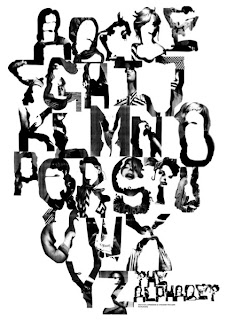
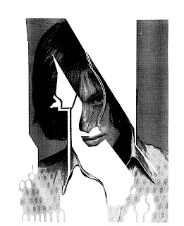
Above - The Alphabet (an a - z of beauty) this design has aspects of illustration and photography working together rather well. The letterforms have been created through photographing models and cutting away various aspects of the image to establish the raw shapes of the letterforms.
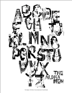
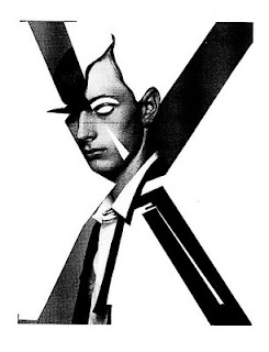
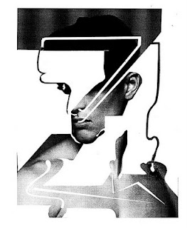
Above - the Alpha Men, this has also been fashioned in the same manor, however the style has a heavier, more dominant feel, when compared to the female version which is somewhat lighter and has more of a feminine flow.
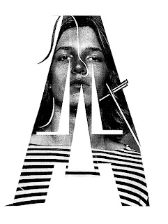
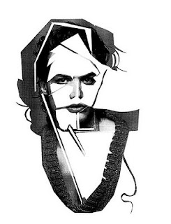
Above - several examples of Alpha Men letters.